Tag Archives: Italy

The World Happiness Report 2015: a wealth of data to make the world a happier place

The World Happiness Report 2015 is out and struck some headlines last week. Number one this year is Switzerland, and Togo comes last. But beyond praising winners and shaming losers, there is a lot more of interested figures to find. A quick selection of some of them.

The good news: how happy are we?

  • Let’s start with the good news. Of 130 countries where it was possible to compare data from 2012-2014 with 2005-2007, 53 saw significant improvements in happiness levels (41 decreased and 36 had no meaningful change). This suggests the world is a slightly happier place then it used to be.
  • The biggest improvements were made in Nicaragua, Zimbabwe, Ecuador, Moldova and Sierra Leone, who each added around one full point in their score.
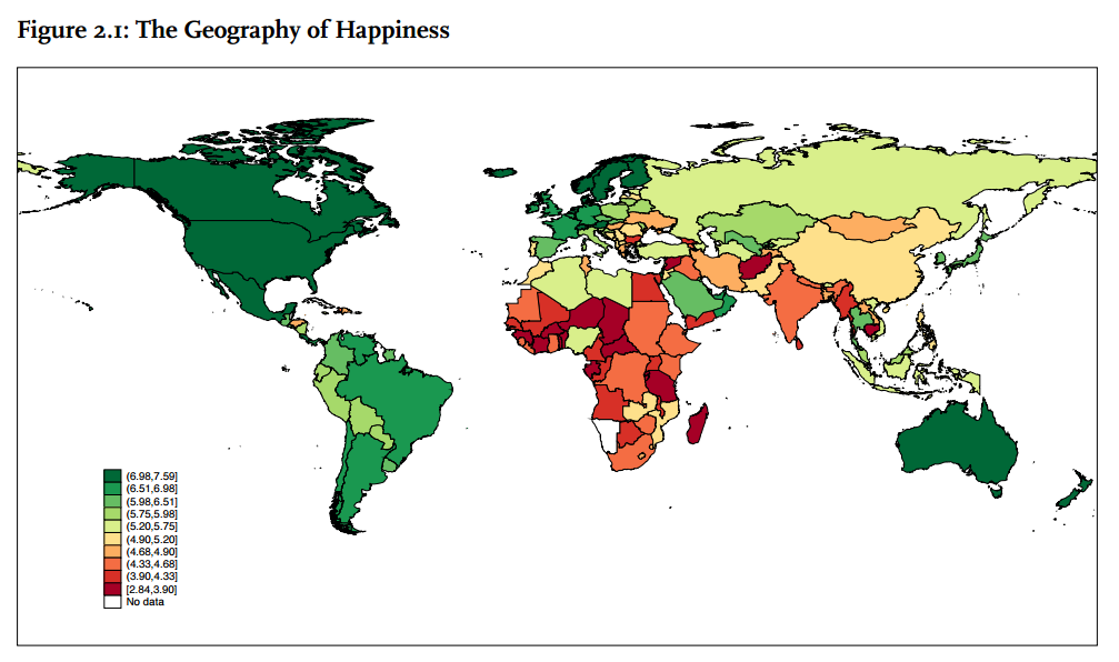
  • It’s the well-expected developing countries that fill the top-1o: Iceland, Denmark, Norway, Canada, Finland, Netherlands, Sweden, New Zealand, and Australia, all a solid 7.3 or higher
  • … and what’s the score of the number one, Switzerland? With three decimals to be Swiss and precise, we get to 7.587.

Other good news (but not in stats)!

  • The most important sections maybe are not those listing the countries, but providing case studies of cities and regions who have changed their policies to make use of all the knowledge about happiness, from Dubai to Jalisco (Mexico), and from Santa Monica to Bristol.
  • At the same time, progress is also made in the neuroscience of happiness. A dedicated chapter 5 summarizes some of the findings. For instance, evidence about the link between positive emotions and happiness appears to be stronger and stronger.
  • There is more and more understanding about the various distribution patterns of happiness within age groups and genders. Overall, women are slightly happier than men. Over age groups, the patterns differ per region: in Central and Eastern Europe, Central Asia and South Asia, happiness goes down as age progresses. But in East Asia, but also in Western Europe, the best comes last: happiness levels go up as people enter their 70s.

The bad news: how unhappy are we?

  • There is still a lot, a lot of misery on our planet. More than fifty countries have happiness levels below 5.
  • And the worst-performing are truly miserable. Countries like Syria and Afghanistan, but also Rwanda, Benin and Burundi fall under 3.6 The lowest level is found in Togo at 2.839.
  • Two countries on different sides of the Mediterranean – Egypt and Greece – have lost more than one point. And some others (Jordan, Rwanda, Saudi Arabia, and Italy) lost around three quarters of a point.
  • For instance, the case of Italy (-.764, now at 5.948) is worrying. Usually, a high happiness level means a high level of resilience in phase of challenge. This fabric might be unraveled as result of the crisis Italy is going through.
  • To end with a positive note: he best ‘losers’, as far as one could be a loser with a score of 7.527, are the Danes. Denmark typically ranks one in most of the happiness report. I have been told that usually, it is no news when a happiness ranking is published, but this time it was: apparently, Danes are not used anymore to come second (or third, as now).

And now?

The 2015 World Happiness Report comes out with a large ambition: influencing the next development goals. As the UN prepares to adopt Sustainable Development Goals (SDGs) to succeed the Millennium Development Goals (MDGs) this year, the hope is that happiness outcomes are targeted within the SDGs. A worthwhile ambition: ultimately increasing human happiness and its fair distribution should be the goal of public policy.

One concern: the SDG process appears to be very complex, with over 150 different – and often, vague – ideas currently on the list of goals that could be adopted later this year. In such a process, they risk to lose their meaning. But either way, the wealth of statistics provides a lot of inspiration and background data to policy makers to make the world a happier place.

Geography of happiness

Where the life is good: the OECD’s Regional Well-Being index

[Gross Domestic Product] measures everything in short, except that which makes life worthwhile

Robert F. Kennedy, 1968

The Organization for Economic Cooperation and Development (OECD) has taken Kennedy’s words to heart. Through its Better Life Index, it is conducting an impressive work programme to analyse quality of life in the 34 developed countries that constitute its membership. The OECD index provides a broad overview of quality life, measuring the performance of countries on various important issues, from housing to environment and from civic engagement to life satisfaction. Like  the Gross National Happiness (GNH) concept, the Better Life Index indicates what the good places to live are in a much broader sense than the mere economic data of GDP could do. Wealth’s correlation with happiness is limited at best, scientists have shown time and again.

But there remains a problem with this kind of national indices: they provide national averages – and do not say anything about the extremes and the equality of the data. California differs from Vermont. Sicily is not the same as Südtirol, the German-speaking part of Italy. To take account of regional differences in quality of life, the OECD has now released a similar website on regional well-being.

Some of the observations:

  • The balance varies a lot across regions. In California, income, jobs and education are at higher levels then in Vermont, but for safety and civic engagement the golden state is a lot worse off than Vermont.
  • Brussels is performing a lot worse on jobs (1.5 points out of 10) and environment (1.6) then I would think, but apparently has a high level of civic engagement (8.6).
  • Across the board, Dutch regions reach high scores, except for income and environment. All over the Netherlands, safety and access to services are close to perfect 10s.
  • Südtirol (or province of Bolzano) is indeed a different world from Sicily. The differences are most striking in the rate for jobs (8.8 vs 0.5). Italy’s figures confirm the large divide in incomes between North and South, whilst incomes are most equal in Austria.
  • Czech regions, to my mind, score surprisingly bad in health but almost all have full scores of 10 for education, here defined as the level of people with secondary education or higher.
  • The Mexican region of Jalisco has adopted well-being as a guiding principle in its policies. Still, it has a lot of space for improvement when compared with regions of richer OECD countries. The region already scores well on jobs and environment. And as a survey from a local NGO suggest, the comparable low scores do not mean that people perceive a low level of well-being. According to their figures, 67% in the region feels prosperous.
Picture 1

Brussels Capital Region, the region where I live, scores well on civic engagement and access to services, but has a lot to improve for jobs and environment. Source: OECD

So What?

Lists and rankings have a broader use than providing bloggers something to browse through on a Sunday night. They can bring order to life – be it by classifying which celebrities are hot and which are not lists, listing the best goals of the World Cup so far (no surprise, Flying Dutchman van Persie tops the list), or of countries which provide the most creative ideas (Ireland is first according to TED).

The OECD list, similarly, provides a benchmark of how regions performance. Seeing where you outperform peers or lag behind gives a motivation to improve. The index can help regions to decide where to focus their resources, and thus make better-informed decision how to spend civil servants’ time and money. As our representatives, politicians and administration should learn from these data. The data can help our administration to perform their duty: continuous improvement of our collective well-being.

Examples of well-being projects in some regions are already included on the OECD site.