For too long, Gross Domestic Product (GDP) has been the king of the indicators for public policy. Money makes the world go round. And GDP measures it. GDP emerged in the 1930s as a metric to measure the size of national accounts and inform policy makers’ decisions. Since, it has developed into a tool to benchmark countries’ performance: GDP growth is equated to progress.
GDP and beyond
Within the beyond GDP movement, many people have challenged this dominance, arguing that a good society is a lot more than economic performance. Social and environmental externalities are discounted in GDP. For instance, economists calculated that the Gulf of Mexico oil spill resulted in a higher GDP! And even GDP’s creator, economist Simon Kuznets, was aware of these limitations. When preparing the pile of statistic data for the US Congress in 1933, he noted that:
The welfare of a nation can scarcely be inferred from a measurement of national income.
Since, many have challenged the dominance as a benchmark in the countries’ annual performance reviews. Most competing indices aim to rebalance GDP, by providing economic performance and add other data in areas as social matters, environment and education. This is the case for indicators like the Humanitarian Development Index (HDI), the OECD’s Better Life Index and Bhutan’s Gross National Happiness.
And further beyond… all economic data!
The Social Progress Index (SPI), however, has a different approach.
The SPI differentiates itself from other challengers to GDP by its unique conceptual choice to stay away from economic data. Instead, it measures social progress via 52 concrete outcomes assessing three key indicators to measure progress: basic human needs, ‘foundations of well-being’, and opportunity (see more in this eloquent TEDx talk).
These concepts are assessed via a series of questions asking about people’s experiences in many aspects that matter for quality of life: how many people have shelter and sufficient water? Do people live in a sustainable ecosystem? How many people experience discrimination? Survey data allow to compare such outcomes based on what people feel, rather than by measuring social issues via public expenditure or laws.
Source: data from Social Progress Imperative, available here.
Social progress does not equate happiness
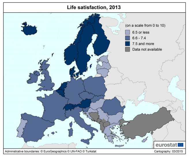
The SPI does not measure happiness or aim to do so. Still, a glance at the wealth of data produced by the SPi suggest that their ranking broadly overlaps with the data from the World Happiness Report. All the top time countries are the same, but in a different order. Switzerland, Iceland and Denmark form the top-three in happiness; for social progress it’s Norway, Sweden and Switzerland.
But there are some differences: especially Latin American countries seem to rank lower in the SPI. Countries like Costa Rica, Mexico, Brazil, Venezuela and Panama benefit from a ‘Latin American happiness bonus and make it to the top-25 in happiness, but fall short of the top-25 in social progress. To the contrary, some highly developed countries (Germany, France, Japan, South Korea) combine lower levels of happiness with higher levels of social progress.
A different data set for policy makers
The main use of SPI as a policy tool is that it is adds knowledge on progress without building on economic data. From that perspective, it may be surprising that there nevertheless is a solid correlation of 0.78 between GDP and SPI. But SPI allows policy makers to make assessment from a different angle. The main benefit is to identify areas where a country is shortcoming comparing to peers with similar GDP levels, and to strengthen the information base about interventions that can address lower performance.
In recent years, policy makers’ interest in beyond GDP indicators has steadily risen. The SPI is also benefitting from this. The European Commission has started talks to integrate the SPI to monitor regional policy outcomes. And in the US, where social progress and happiness are lagging behind economic strength, several local and state level politicians have started to integrate SPI information in their dashboard of monitored outcomes. For instance, the city of Somerville, Massachusetts, has started analysing tailored SPI analytics on the local level. And in the state of Michigan, social progress indicators are included in a set of key performance indicators.
Data for a good society
This is exactly what alternative indicators should do. GDP has a value. Economic data provide a useful understanding about people’s lives. But if you want to find out what a good society is, and whether you are on an upward or downward trend, there is a lot more to watch. The SPI provides a great contribution to help policymakers find out on which areas they should work to make their country progress.

